Design Tokens or Whole Components: What to Give an AI Coding Agent
- guide
- ai
- design

There are two schools of thought on how to brief a coding agent about design. One says: give it the system. Colours, type scale, spacing, radii, and let it compose. The other says: give it the thing. The actual component, rendered, with every style attached, and let it copy.
Having watched a lot of plucks go into a lot of agents, we think the question is slightly wrong. Tokens and components do different jobs, and the best results come from using each where it is strong. This post lays out what each one actually gives the model, where each one fails, and the order we recommend.
What a design token tells the model
A token is a named value: --color-primary: #4F46E5, --space-4: 16px, --radius-md: 8px, a font stack, a shadow. A set of tokens is a vocabulary.
Handing an agent your tokens does three useful things.
- It constrains choices. The model will not invent a seventh grey if it has been told there are six.
- It makes output consistent with the rest of your codebase. New components use the same variables the old ones do.
- It is small. A full token sheet fits in a few hundred lines and never overwhelms the context window.
What tokens do not tell the model is anything about composition. A palette and a spacing scale do not say that a card has 24px of padding, a 1px border in grey-200, a 12px radius, and a title that sits 8px above its description. The model will guess those relationships, and the guess is where "looks AI-generated" comes from: correct colours, generic structure.
If you have ever handed an agent a tidy tokens file and got back something that was on-brand but shaped like every other dashboard on the internet, that is the failure mode.
What a whole component tells the model
A plucked component is the opposite kind of input. It is a tree of real elements with the computed style of every node: not "radius-md" but "12px, on this element, with this border, at this breakpoint". It also carries a screenshot, so the model sees the result as well as the recipe.
That gives the model exactly the thing tokens lack: composition. The relationships between elements are in the data. Which items are in a flex row, which wrap, how the gap changes at 768px, where the shadow sits. We wrote about why this beats a screenshot alone in Why Screenshots Make Bad Prompts.
Components have their own failure modes.
- They are specific. A plucked pricing table is great for building a pricing table and not much use for building a settings form.
- They carry the source site's values, not yours. Paste a component from another product and the agent will reproduce that product's indigo, unless you say otherwise.
- They are bigger than tokens. A whole page section is a lot of text. Pluck the section you mean, not the entire page, and this stays manageable.
The order that works: component first, tokens as the constraint
The combination we recommend, and the one that produces the fewest follow-up prompts, is:
- Pluck the component that has the composition you want.
- Paste it into the agent.
- Add one line that points at your tokens as the thing to map onto.
In practice that looks like:
Rebuild this as a React component with Tailwind. Keep the layout,
spacing and breakpoints exactly. Replace its colours, font and radii
with ours from tailwind.config.ts and app/globals.css.
The pluck supplies the structure; the one line tells the model to swap the vocabulary. Because the agent is working in your repo, it can read the token files itself. You do not need to paste them.
This is also why the extension's stack picker matters. Set it to your framework and styling approach (Tailwind, CSS Modules, Styled Components or Vanilla Extract, with React, Vue, Svelte, Solid or Qwik) and the pasted prompt is already phrased for the codebase the agent is in. Leave it on Auto and Pluck matches what it can infer.
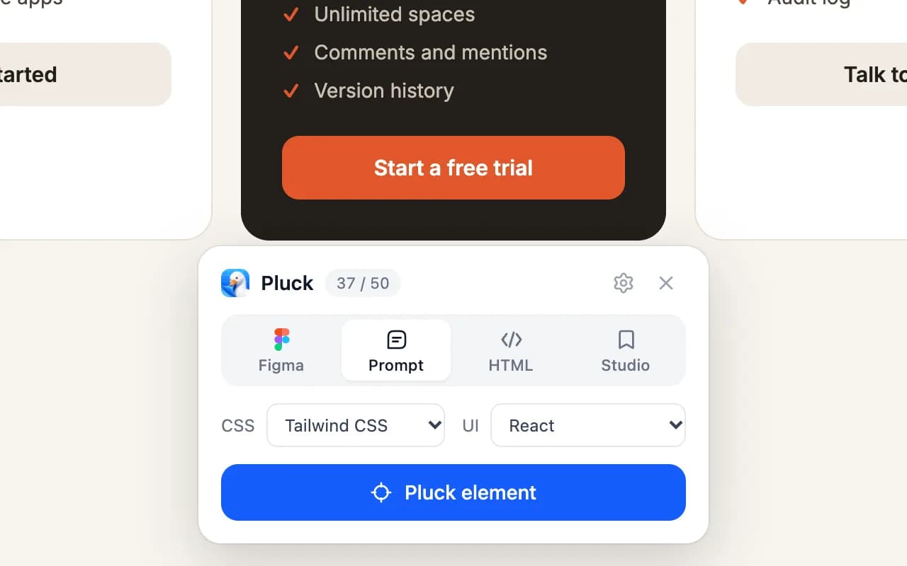 The stack picker in the extension: set it once and every prompt is phrased for your codebase.
When tokens alone are enough
Sometimes you do not want anyone else's composition. You are building a form, a table or a modal that should look like the ones you already have, and the only thing to borrow is nothing. In that case a token sheet plus a pointer to an existing component in your own repo is the right brief:
Build the invite-member modal. Match the structure of
components/ui/dialog.tsx and use our tokens. No new colours or radii.
The agent already knows your system from the code. Tokens are a reminder, not a source of new information.
A related trick: pluck your own component instead of pointing at the source. The rendered pluck includes the computed result of your theme, plugins and CSS variables, which is sometimes more reliable than the model reading three files and composing them in its head. Pluck Your Own App covers that workflow.
When a whole component is enough
The reverse case: you are prototyping, there is no design system yet, and the plucked component is the design. Paste it and ask for a faithful rebuild. Do not mention tokens, because there are none, and let the source's values stand.
This is common in v0, Lovable and Bolt projects, where the first version of a product is assembled from references and the system is extracted later. How to Copy a Website Component into v0 and Bolt and into Lovable go through those tools.
Extracting tokens from a component you plucked
A pluck is also a decent way to get tokens in the first place. Because every node's computed style is in the data, you can ask the agent to pull out the distinct values:
From the pasted component, list every distinct colour, font size, line
height, spacing value, radius and shadow. Propose a token name for each
and write them as CSS variables.
This turns a reference into a starter system in one step. We go through it in more depth in How to Extract Design Tokens from Any Website. Do it for two or three sections from the same site and the overlap tells you what the real scale is.
A rule of thumb
If you remember one thing: tokens answer "what values", components answer "what shape". Agents are good at applying values and bad at inventing shape. So give them the shape from a real component, and give them your values to apply to it.
Pluck makes the first half a single click. Your codebase already has the second half.
Install Pluck and try it on the next component you were about to describe in words.