ComfyUI for UI Design: Why It's Hard, and What to Use Instead
- guide
- studio
- comparison

ComfyUI is the most flexible image generation tool there is. If a model exists, someone has wired it into a ComfyUI graph, and if a technique exists, there's a custom node for it. So when people want AI-generated mockups of a landing page or a dashboard, ComfyUI is often where they start.
It can work. But a lot of people find that designing an interface in ComfyUI is harder than it should be, and the reasons have little to do with how good ComfyUI is. They come from the gap between what ComfyUI was built for and what a UI mockup needs.
This post covers that gap honestly, where ComfyUI is still the right choice for design work, and what a tool built for interface design does differently. We make one of those tools, Pluck Studio, so weigh our view accordingly. We've tried to be fair.
What a UI mockup actually needs
A generated portrait or landscape succeeds if it looks good. A generated interface has a stricter brief:
- Text that reads. Headlines, button labels, nav items, prices, table headers. A mockup with garbled text isn't something you can show a client or build from.
- Familiar structure. Navigation at the top, a hero, a feature grid, a pricing table, a footer. Interfaces follow conventions, and a mockup that breaks them looks wrong even when it's pretty.
- Specific references. "Make it feel like Linear's pricing page with Stripe's navigation" is how designers actually brief, and the generator needs to see those exact things.
- Fast iteration on the whole. Most of the work is "same, but tighter spacing" or "the hero from this one with the footer from that one".
- A way forward. Once you like a direction, you need to build it. An image is a sketch, not a deliverable.
ComfyUI can do some of this. It wasn't designed around any of it.
Where ComfyUI struggles with interfaces
Small text is still hard for many models
Open-weight models have improved a lot at rendering text, but the small text interfaces are full of (button labels, table cells, footnotes, prices) is still where many of them slip. You can fix that in ComfyUI by routing the job through a hosted model with its Partner Nodes, such as Nano Banana or GPT Image, which are much better at UI text. That works well, but at that point the graph is mostly a front end for a hosted API.
References are screenshots you have to collect yourself
To give a ComfyUI workflow a reference, you find the page, screenshot the part you want, crop it, save it and load it into the graph. Every reference you add is another loader node to connect. It's fine for one image and tedious for five, and a screenshot loses everything except the pixels: what the component was, which site it came from, and the CSS that made it look that way.
The graph is overhead for a design question
When the question is "what should this settings page look like?", the interesting decisions are about layout, hierarchy and mood. Choosing samplers, wiring encoders and keeping custom nodes up to date is real work, and it's work about the tool rather than the design. People who enjoy that work love ComfyUI for it. People who just want to see three directions for a settings page often give up.
The output is the end of the line
A ComfyUI workflow ends with an image file. For a mockup, that's where the real work starts: someone has to turn it into a Figma file or code, usually by eyeballing it.
Where ComfyUI is still the right tool
There's a lot of design work where ComfyUI is better than anything else, including us:
- Assets that go into the design: hero illustrations, product shots, textures, backgrounds, icons in a consistent style. That's what open-weight models, LoRAs and ControlNet are great at.
- Refining a finished image: upscaling, inpainting a region, fixing a hand or a logo.
- Motion: turning a still into a short video for a landing page or a social post.
- Anything you need to run offline or on your own GPU, or anything where you need control over every setting.
If that describes your work, keep using ComfyUI.
What a design-first canvas does differently
Pluck Studio is built around the brief above rather than around models.
- References come from the web, not screenshots. With the Pluck extension you click a component on any live website, and it's saved to your library with its screenshot, the page it came from, and its full style data. Collecting five references takes five clicks.
- A board replaces the graph. You drop references onto a board and connect them into a prompt card with a written brief. The connection is the whole setup: there are no loaders, encoders or samplers to wire.
- The models are picked for UI. Every prompt runs on Nano Banana 2, Nano Banana Pro, GPT Image 2, Seedream, Ideogram or Recraft, or free on your own machine through Codex. Auto picks a model that renders UI text well when your brief mentions headlines, buttons or pricing, and the card shows the credit cost before you run.
- Iteration is built in. Connect generations back into a prompt and choose Each or Combine: apply one change to every candidate, or merge the best parts of several into one. Or ask the board chat to "add the pricing table from my library and run again at 16:9".
- The image isn't the end. The components behind a direction are still in your library with their styles, so you can copy them as a prompt for Cursor, Claude or Lovable, or paste them into Figma as layers, and build the real thing.
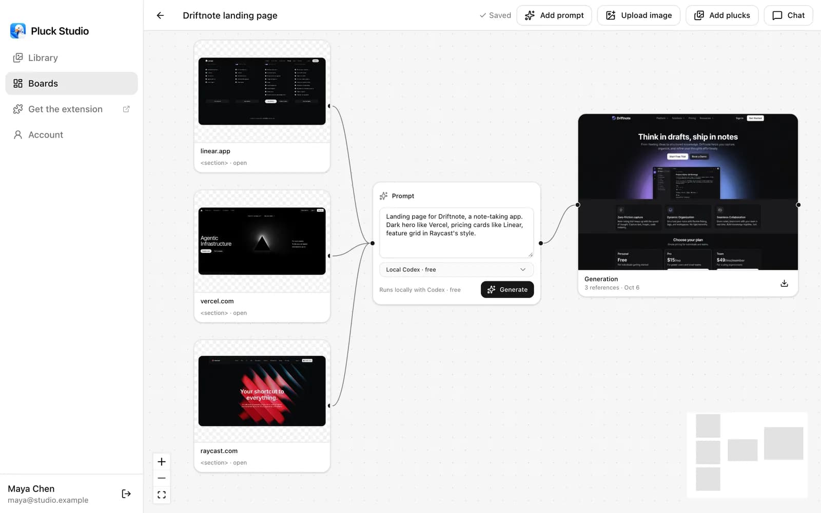 References, a brief and a result on one board, with nothing to wire but the connections.
What you give up is everything in the list above: no open-weight models, no LoRAs, no inpainting, no video, no offline mode, and fewer settings. We've put the full side-by-side on Pluck vs ComfyUI.
Use each for what it's good at
For most designers this isn't an either/or. Find the direction of a screen in a tool built for interfaces, then make the assets and polish the pixels in ComfyUI. We wrote up that workflow in Using Pluck and ComfyUI Together.
If your ComfyUI graphs are mostly a Load Image node feeding a Nano Banana node, Nano Banana and GPT Image Without a Node Graph is the shorter version of this post.
Try it
Pluck Studio is free to start: the library, boards and local generation with the desktop app are included on the Free plan. Hosted models start at $10 a month on Starter.