How to Copy Any Navigation Bar into React (With a Real Example)
- tutorial
- ai
- extension

Navigation bars are the component people rebuild most often and enjoy least. They look simple and are not: a logo, a row of links, a couple of buttons, and then a completely different layout under 768px with a hamburger, a slide-in panel and focus handling nobody wants to write.
This tutorial takes a navbar from a live site to a working React component in about ten minutes. You will need the Pluck extension and any AI coding tool that accepts text and an image. We use Claude Code below; the steps are the same in Cursor, Codex, v0 or Lovable.
Step 1: Find a navbar worth copying
Pick a site whose header does what you need. For this walkthrough we used a developer-tools marketing site with a classic layout: logo on the left, five links in the middle, a "Sign in" text link and a "Get started" button on the right. At narrow widths it collapses to logo plus a menu button.
If you want a mobile-first capture, narrow your browser window before plucking. Pluck records the responsive breakpoints either way (see Responsive by Default), but the primary capture is whatever is rendered right now.
Step 2: Set the stack and pluck the header
Click the Pluck icon. Before selecting, choose Prompt in the Pluck card and set the stack picker to React with Tailwind. This phrases the copied prompt in the vocabulary your project uses, so the model does not hand you plain CSS you then have to translate.
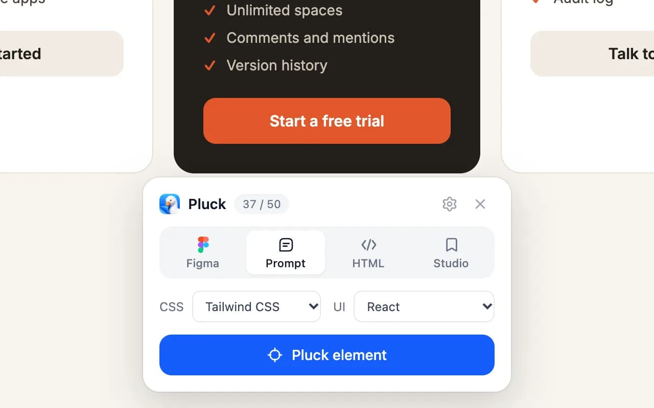 Prompt mode with the stack set to Tailwind CSS and React.
Press Pluck element and hover over the page until the whole header is outlined. You want the outermost element: the header or nav, not just the link list. Click it, and the prompt is copied straight away.
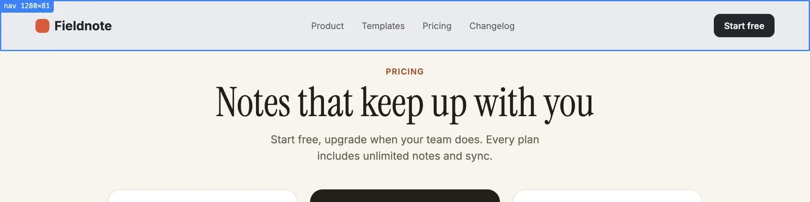 Outline the outermost header element, not just the link list.
Your clipboard now holds the element tree with computed styles for every node, the breakpoint behaviour, and a screenshot. The pluck is also saved to your Studio library in case you want it again next month.
Step 3: Paste with one line of intent
Open Claude Code in your project and paste. Then add a single instruction. Resist the urge to describe the navbar; the pluck already did that. Describe what you want done with it:
Build this as components/site-header.tsx, a React client component
with Tailwind. Keep the layout, spacing and breakpoints exactly.
Replace the site's colours and font with ours. Links: Product,
Pricing, Docs, Blog, Changelog. The mobile menu must be a real
toggle with aria-expanded and close on Escape.
That is the whole prompt. The pluck carries the design; your line carries the intent and the project specifics.
Step 4: What you get back
Here is a trimmed version of the component Claude Code produced for us. Your result will differ in detail, but the shape is representative.
"use client";

import Link from "next/link";
import { useEffect, useState } from "react";

const links = [
	{ href: "/product", label: "Product" },
	{ href: "/pricing", label: "Pricing" },
	{ href: "/docs", label: "Docs" },
	{ href: "/blog", label: "Blog" },
	{ href: "/changelog", label: "Changelog" },
];

export function SiteHeader() {
	const [open, setOpen] = useState(false);

	useEffect(() => {
		const onKey = (e: KeyboardEvent) => {
			if (e.key === "Escape") setOpen(false);
		};
		window.addEventListener("keydown", onKey);
		return () => window.removeEventListener("keydown", onKey);
	}, []);

	return (
		<header className="sticky top-0 z-40 border-b border-border/60 bg-background/80 backdrop-blur">
			<div className="mx-auto flex h-16 max-w-6xl items-center justify-between px-6">
				<Link href="/" className="font-semibold tracking-tight">
					Acme
				</Link>

				<nav className="hidden items-center gap-8 md:flex">
					{links.map((l) => (
						<Link
							key={l.href}
							href={l.href}
							className="text-sm text-muted-foreground hover:text-foreground"
						>
							{l.label}
						</Link>
					))}
				</nav>

				<div className="hidden items-center gap-3 md:flex">
					<Link href="/login" className="text-sm font-medium">
						Sign in
					</Link>
					<Link
						href="/signup"
						className="rounded-full bg-primary px-4 py-2 text-sm font-medium text-primary-foreground"
					>
						Get started
					</Link>
				</div>

				<button
					type="button"
					className="md:hidden"
					aria-expanded={open}
					aria-controls="mobile-nav"
					onClick={() => setOpen((v) => !v)}
				>
					<span className="sr-only">Toggle menu</span>
					{/* icon */}
				</button>
			</div>

			{open && (
				<nav id="mobile-nav" className="border-t md:hidden">
					<ul className="space-y-1 px-6 py-4">
						{links.map((l) => (
							<li key={l.href}>
								<Link href={l.href} className="block py-2 text-base">
									{l.label}
								</Link>
							</li>
						))}
					</ul>
				</nav>
			)}
		</header>
	);
}
A few things to notice, because they came from the pluck rather than from the model's defaults:
- The header height, horizontal padding and the 32px gap between links match the source's computed values.
- The
md:breakpoint is where the source switched layouts, not a guess. - The sticky, translucent, blurred background was in the source's styles and got carried through.
- The link colours are muted-foreground on hover-to-foreground because we asked for our palette; the structure that said "links are a quieter colour than the buttons" came from the pluck.
Step 5: Fix the mobile menu properly
Models get the desktop row right almost every time. The mobile menu is where you should spend your review, because the source's mobile markup is often hidden until toggled and Pluck captures what was rendered at the moment you clicked.
If the mobile panel in your result looks thin, open the source site, narrow the window, open its mobile menu, and pluck the header again in that state. Paste it with:
Here is the same header with the mobile menu open. Match this for the
open state: panel layout, spacing, and the order of the links and
buttons.
Then check the three things that matter for a usable mobile nav:
- Toggle semantics. The button has
aria-expandedandaria-controls, and the panel has the matching id. - Escape and outside click. Escape closes it (shown above). Add an outside-click or route-change close if your framework does not reset state on navigation.
- Scroll lock. If the panel is full-height, lock body scroll while it is open. Ask the model: "lock body scroll while the mobile nav is open".
Step 6: Swap in your own pieces
The last step is making it yours. Replace the text logo with your logo component, point the links at real routes, and if you use a component library, ask the model to use its button:
Use our Button component from components/ui/button for "Get started"
instead of the inline classes.
If the navbar needs a dropdown (a "Product" menu with sub-items), pluck one from a site that has it and paste it as a second reference: "add a dropdown under Product like this". Composing a header from two or three plucks is normal and gives better results than describing the dropdown in words.
Why this beats starting from a template
A template gives you a generic navbar you then bend toward the design you wanted. A pluck gives you the design you wanted, with the responsive behaviour already encoded, and you bend it toward your codebase instead. The second direction is shorter.
It is also the same workflow for every component. The pricing table in Pluck a Pricing Table and Rebuild It in Tailwind follows identical steps, and so does anything else you can outline with your cursor.
One reminder: use what you pluck as a reference for your own work. Copying a site's layout and responsive behaviour to build your own header is normal practice; shipping its logo, copy and brand is not. Is It Legal to Copy a Website's Design? has the practical version.
Install Pluck and try it on the next header you were going to build from scratch.